Why Shizen ? Why rebranding ?
Reason I:
-
I have passed this road hundreds of times, but I never found that there is a very famous and very delicious restaurant here until I saw the crowds outside one day.
After all, its appearance is really inconspicuous, it is a dusty gem.
Reason II:
-
At the beginning, even if I noticed that there is a restaurant here, from his menu design to the exterior signboard, I never thought it was a very high-concept restaurant. I summarize the reasons as follows:
-
Uniformly use brand specifications
-
Logo is difficult to recognize
-
Not only does the menu fail to show the naturalness that the brand emphasizes, it is also not easy to read.


In order to make a design closer to the restaurant, I am used to first understand the philosophy of the restaurant and understand the message that the restaurant wants to convey to people.
“Shizen creates healthy and flavorful dishes with a light footprint to protect the ocean from overfishing. “

Photo from Shizen
Logo Design
I tried many different styles and combined their creative ideas to design Shizen’s logo.
For example, using Shizen's "S" combined with Japanese flowers and ingredients, emphasizing the elegant and natural feeling. Use Japanese writing or make traditional Japanese seal signs to create the atmosphere of a Japanese restaurant.

Finally, although the logo made with S combined with Japanese flowers is very elegant, I chose one that looks more natural and emphasizes grounding. Because the idea of this restaurant is to bring people closer to people through nature.


Polished the look
Based on my one-year interior design experience and with reference to the exterior of many Japanese high-end restaurants, I made the following adjustments based on the original decor of this sushi bar:
-
Signage
With the newly designed logo, I used a Japanese light box to make the original sign more prominent. And because it is a bar, it emits fluorescent LED lights at night.
-
Bamboo Roller blind
-
Add Tapestry at the entrance
In Japan, many high-end restaurants have door curtains at the entrance with the restaurant's logo printed on them. I apply this kind of tapestry here, so that when the customer lifts the tapestry, they will change their mood and look forward to the new experience that will come.

Before:Signs that are still dark at night with overly complicated lines.

After. A more prominent signboard and an exterior reminiscent of Japanese style
Interactive situational experience
Looking up, you feel like you are at the bottom of the sea.
Looking down, you know you're down to earth.
In order to echo the key philosophy of SHIZEN - saving marine life and using local ingredients.
On the way, which waiter leads them to their seats, they can feel that they are going through a harvest journey. Through interactive sensing, the projectors project the growth stages of different crops as they pass.
I projected the underwater world on the ceiling, so that customers can understand what they have contributed to the ocean when they enjoy the food.


Schematic diagram of plant growth
Time to order
In order to reduce human-to-human contact during the epidemic, we use the ordering system to reduce conversations. At the same time, it also allows customers to control the rhythm of their own ordering.


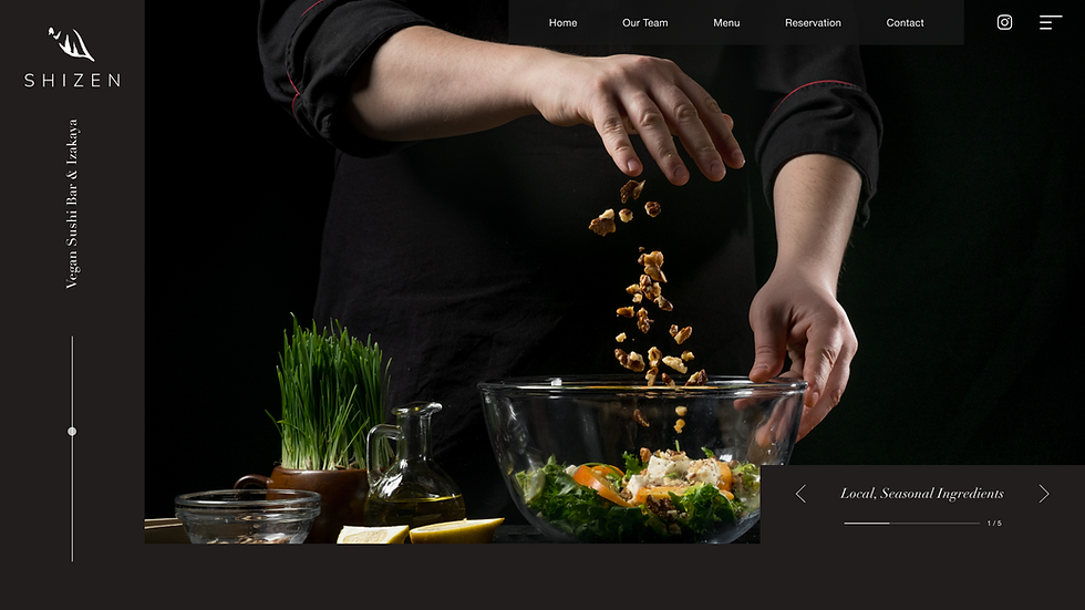
Website
Modern people are used to researching what the restaurant has before going to it.
Therefore, the official website can help customers build the overall image of the restaurant.

Printing and peripheral products


Foil Stamping, white ink
Advertisement
It is sushi but not sushi?
Instead of using traditional fish, it is replaced by vegetables that change with the seasons. This is a very innovative concept. However, in what way can we make viewers think of sushi without being constrained by traditional stereotypes?
I use deconstructive techniques to separate the elements of sushi.
When it comes to sushi, people easily think of Japan, so I used the red circle that represents the Japanese flag as the focal point of the whole vision. In addition, the circle is filled with Japanese gardens to enhance details.
An important element of sushi-"rice" has also been separated. It is covered with a green leaf that represents "natural" and "vegetable" and has a strong contrast with red. (The concept of this leaf can also be brought to the design of the Logo)
The entire poster uses planetary trajectories as decoration. Copernicus's movement of celestial bodies is an innovation in scientific concepts, and I want to transfer this innovative concept to sushi dishes. The feeling after tasting this kind of sushi is like discovering a new planet.


