Role
Research / UI / UX
Tool
Figma / Photoshop / illustrator
Due to the fluctuation of the market economy, despite producing more food, today's farmers earn less and less.
Farmily is a bridge that try to shorten the distance from farm to table.

Dilemmas when farmers
sell through middlemen
Lower Profit
Sell directly to consumers can earn up to five times more per unit than those who sell through intermediaries. Also, Direct-sales farmers were able to set their own prices, while those selling through intermediaries had to accept their prices.
Limited feedback from customers
Farmers may have limited feedback from customers and this can make it difficult for farmers to improve their products and meet the needs of their customers.
Higher environmental impact
When farmers sell their products through intermediaries, it can lead to a higher environmental impact due to the transportation and distribution of products, while relying on long-distance transportation can increase greenhouse gas emissions by up to 35% compared to local food systems.
What about Farmers market?
Where Farmers can sell product directly to the customers.
Not have enough time to shop,
nor conveniently located
It was reported by 36% of respondents that they did not have enough time for farmers markets, and 32% that the markets were not conveniently located.
63% of farmers markets
only accept cash
Most of the stands only accept cash, which can be an inconvenience for customers who prefer to pay with debit or credit cards.

How Might We
“SHORTEN THE DISTANCE FROM FARM TO TABLE” ?
This is the reason why Farmily exists:
A channel for a farmer to directly sell and listen to the voices of consumers.
An opportunity for a consumer to make the Earth more friendly

In order to better understand the market and users, I started to conduct some investigations


FEATURE 01
PURCHASING
-commerce with a story.
Buy ingredients that make you feel better than ever!
#E-Commerce
#Buy Directly From Urban Farmers
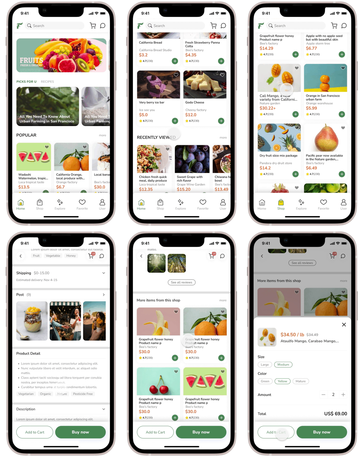
The primary features in this app is an e-commerce, which allows people to place orders anytime, anywhere from Urban Farmers.
The main user flow will be:
Surfing the products → Add the product to Cart → Checkout the Cart → Place order


FEATURE 02
EXPLORE THE NATURE
Explore the business hours, locations, types of vendors, and more of Farmers market.
#map exploration #market information
Here, people can search for Farmers market in the area by location or keywords. Filters can be selected: rating, opening hours and number of vendors.
You can switch between map mode or list mode. When using map mode, the information card below will change according to the Pin.


FEATURE 03
BUILD EMOTIONAL CONNECTION
Create deeper connections through images or stories.
#inspiration #story #share #season
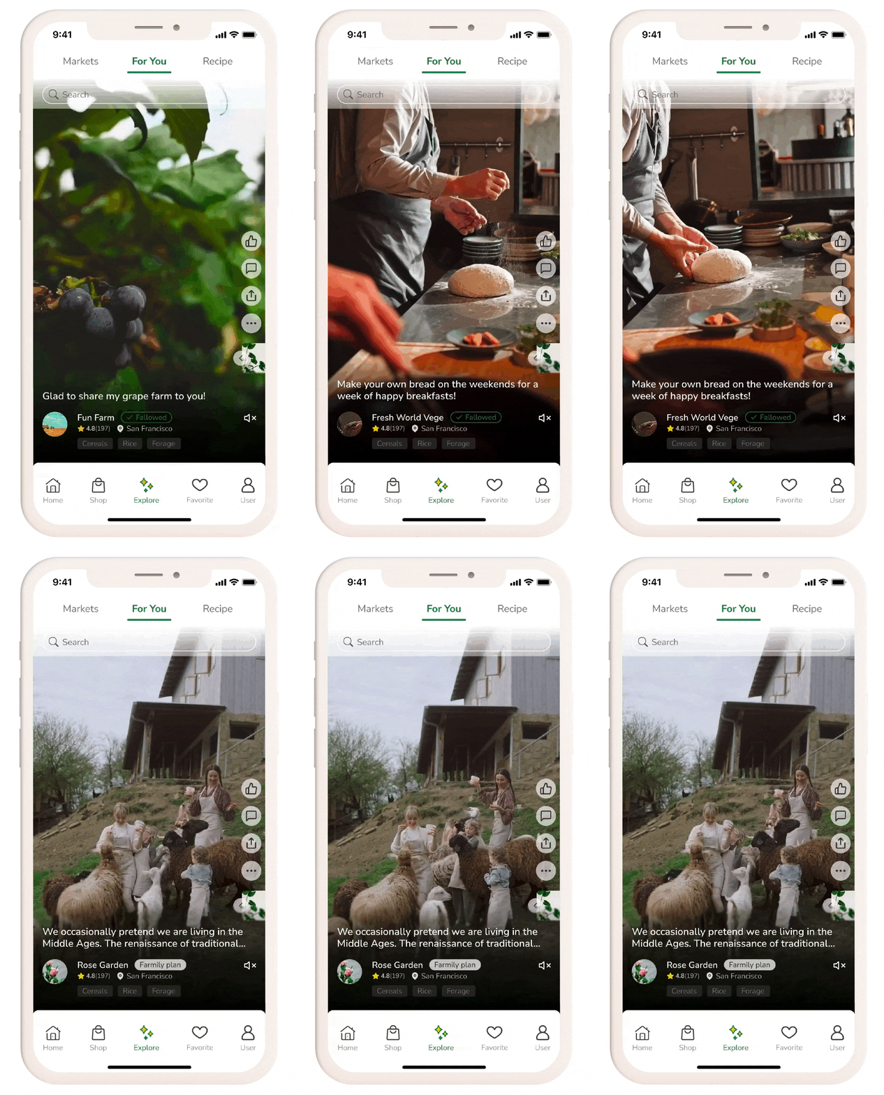
Here farmers can freely share their work, life, or snacks, cakes, etc. made from their crops.
Users can also click to view listings and related products that appear in the video.

FEATURE 04
GET INSPIRED
Discover recipes, inspiration.
#recipe #cooking tips #inspiration #holiday
Users can share various recipes. There is a search function to search for specific recipes or find inspiration for cooking according to seasons, special holidays, etc.

Testing,
to make the product closer to the needs of users
USABILITY TESTING
Generally, people who pay more attention to diet and health are also more concerned about the source of ingredients. Therefore, I have targeted the group of people who usually cook by themselves and whose spending power is higher than or equal to the average.

ADJUSTMENT 01
PRODUCT PAGE _ ORDER
The page has two areas for user comments: Post & Review.
For first-time users, if the two areas are placed at a distance, they will be a little confused, aren't both of them comments? What is the difference?
So I decided to put these two areas next to each other.
Another thing is, I move post and review after the product description, because my interviews tell me they usually read the detail about the product first.

ADJUSTMENT 02
CHECKOUT PROCESS
It will be easier to understand if the choice of shipping method can be displayed on the shopping cart screen at the beginning. The content displayed on the Review order should be a page where almost all products have been confirmed.

ADJUSTMENT 03
FARMERS MARKET REDIRECTION
The address is currently not clickable, but it would be more convenient if a function can be added to directly link to the map navigation. So I changed the original design and made the icon feel more touchable. When the user clicks, they can jump to the map navigation.

Inspiration from this design project

INSPIRATION FROM THIS PROJECT
IS IT ENOUGH TO
JUST MAKE THE PRODUCT CONVENIENT TO USE?
Different from the general direct shopping process. After conducting an investigation and interviewing users, I found that many users value not only the convenience of online shopping, but also building emotional connections with products. When people learning new things from others, it brings them good feelings.
To understand the producer through the product, and sometimes it is the other way around, first to know the producer and then to know the product. This is a very interesting interaction process, and it also adds to my thinking about how to bring emotional connection into the user experience.


